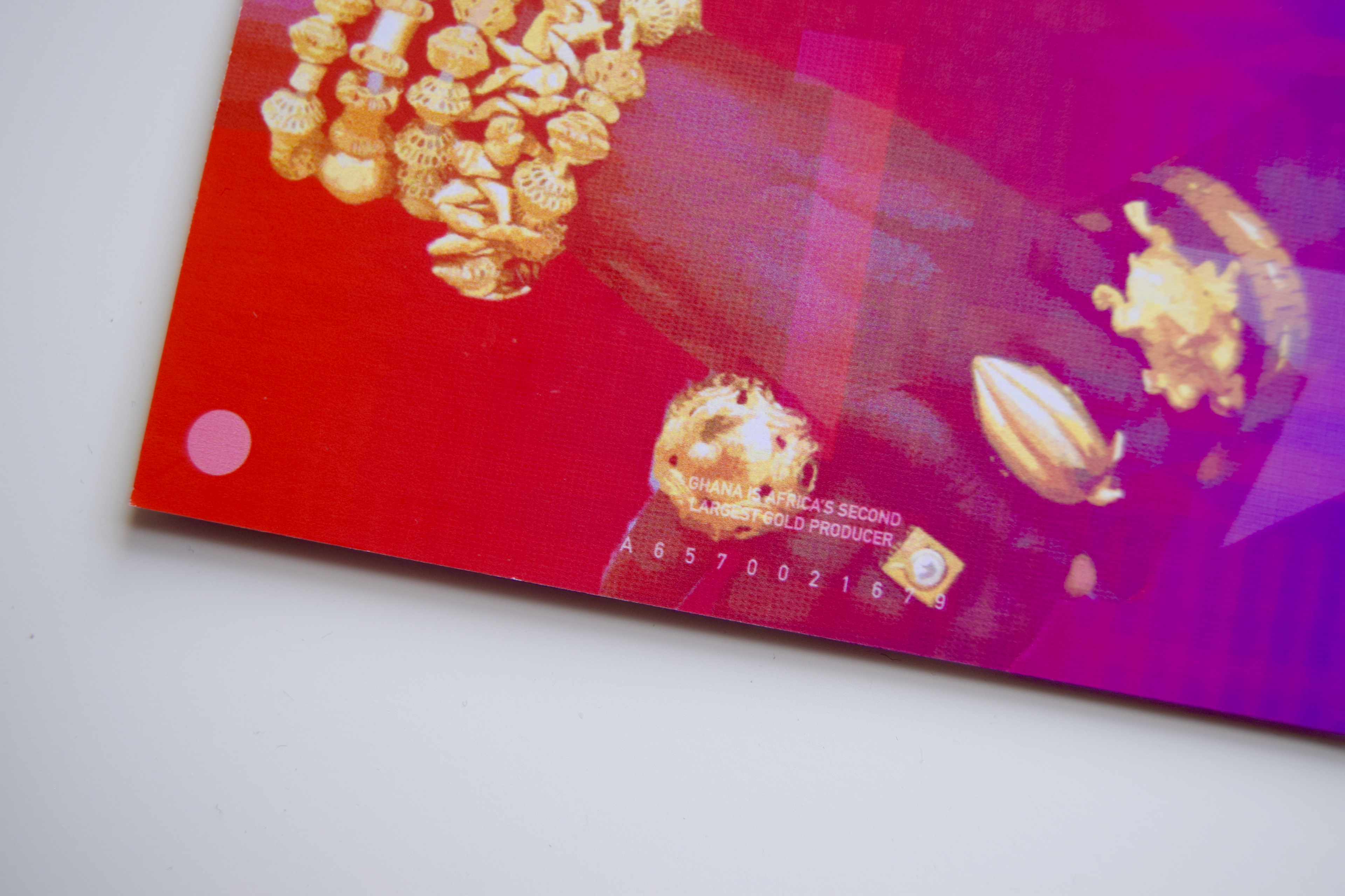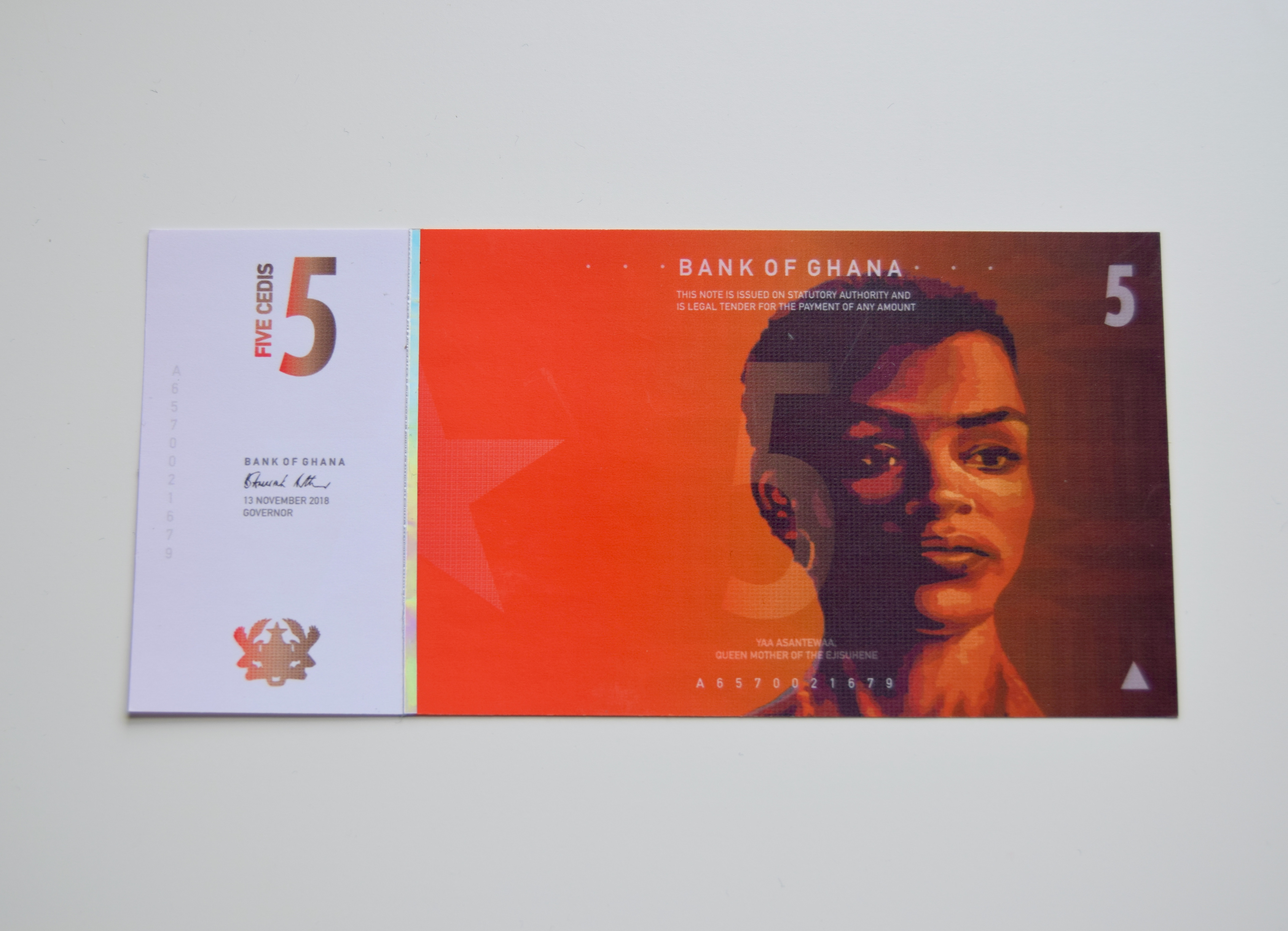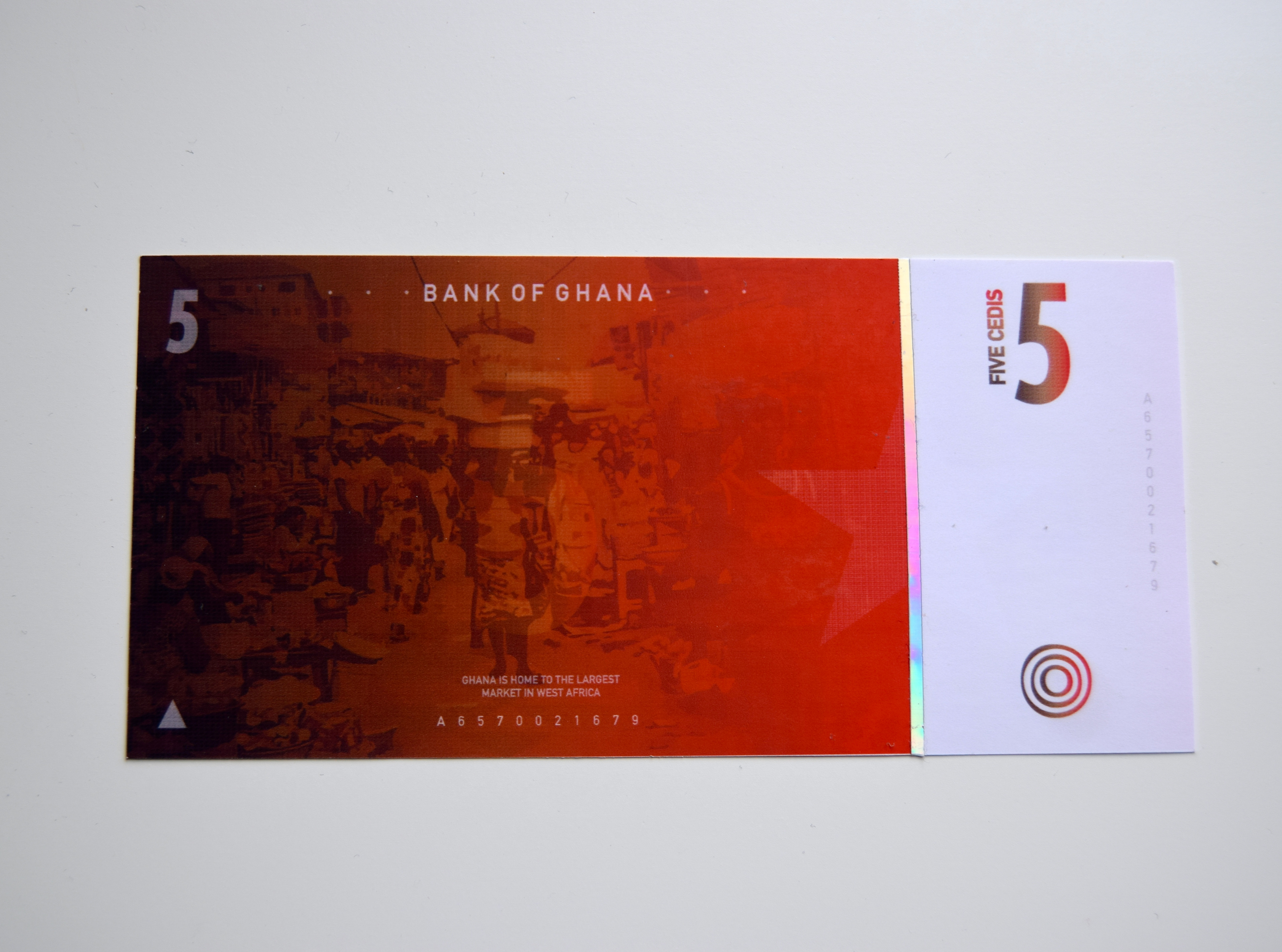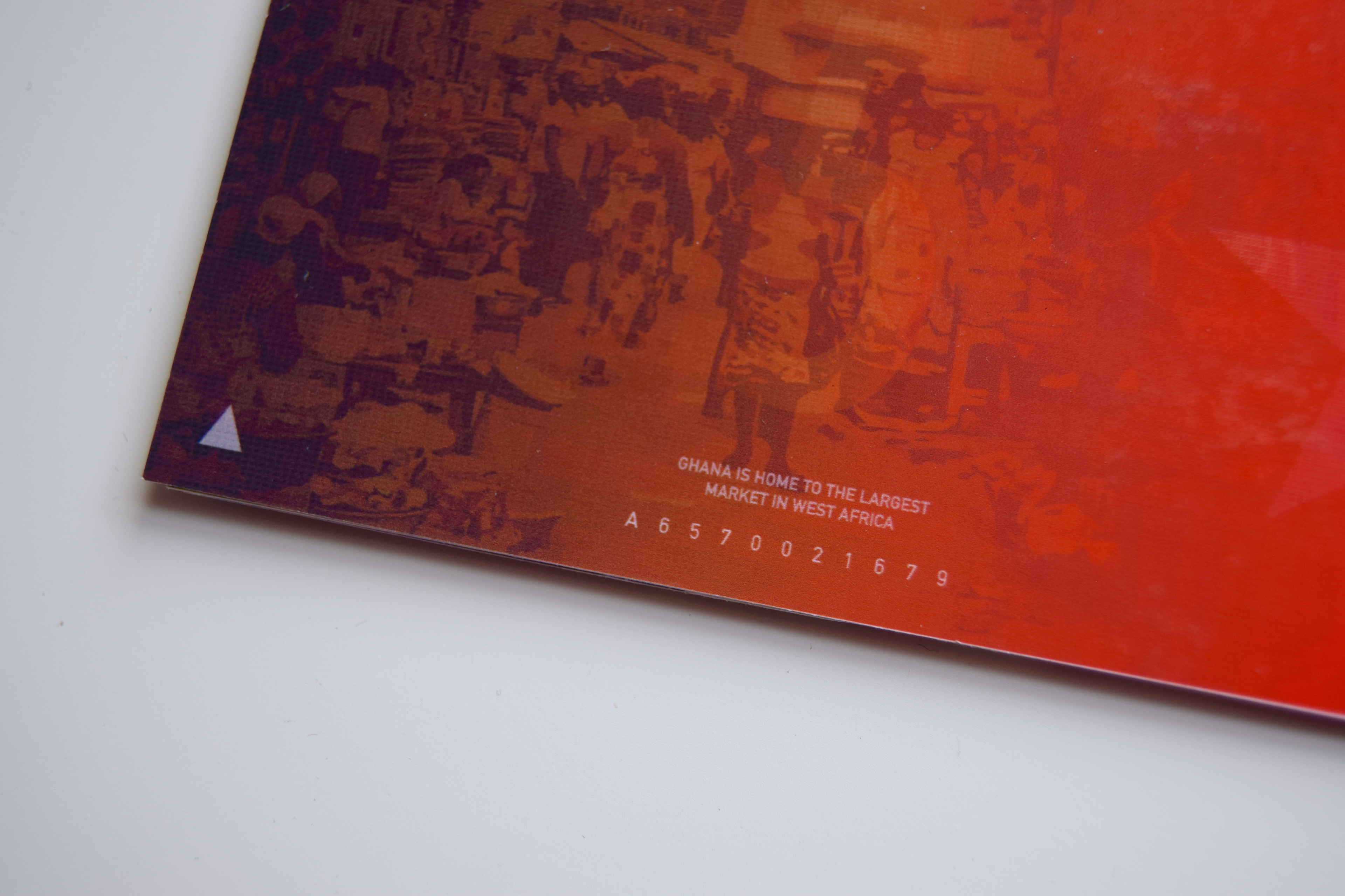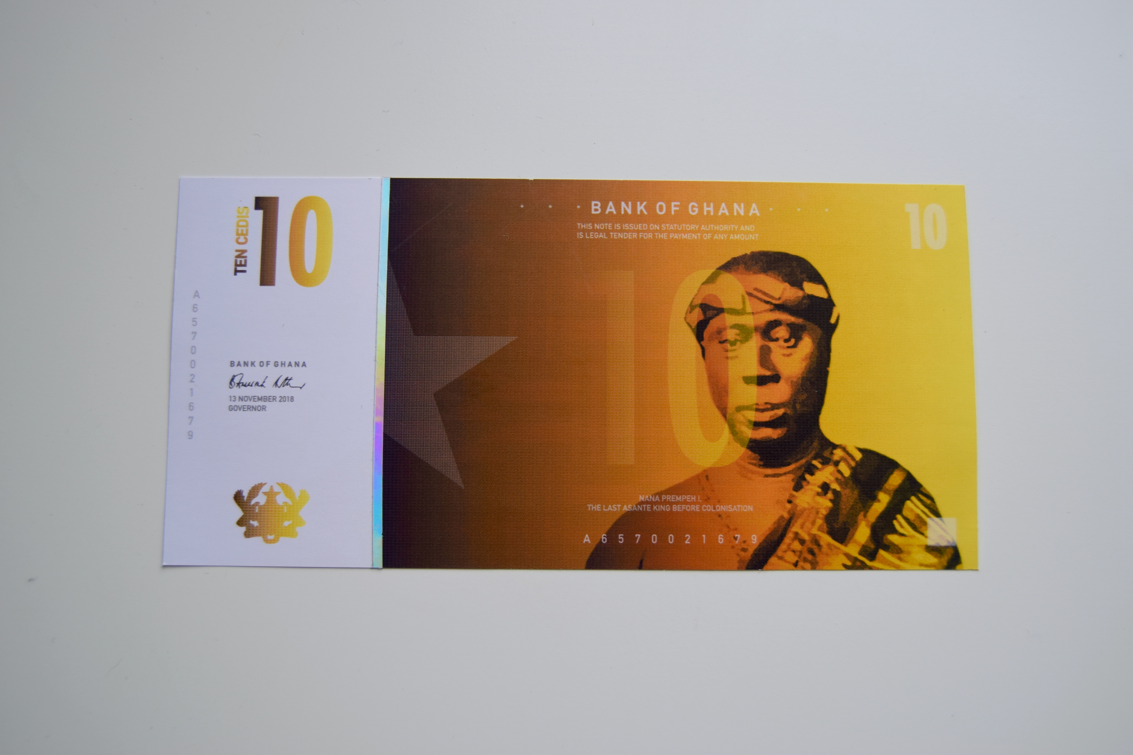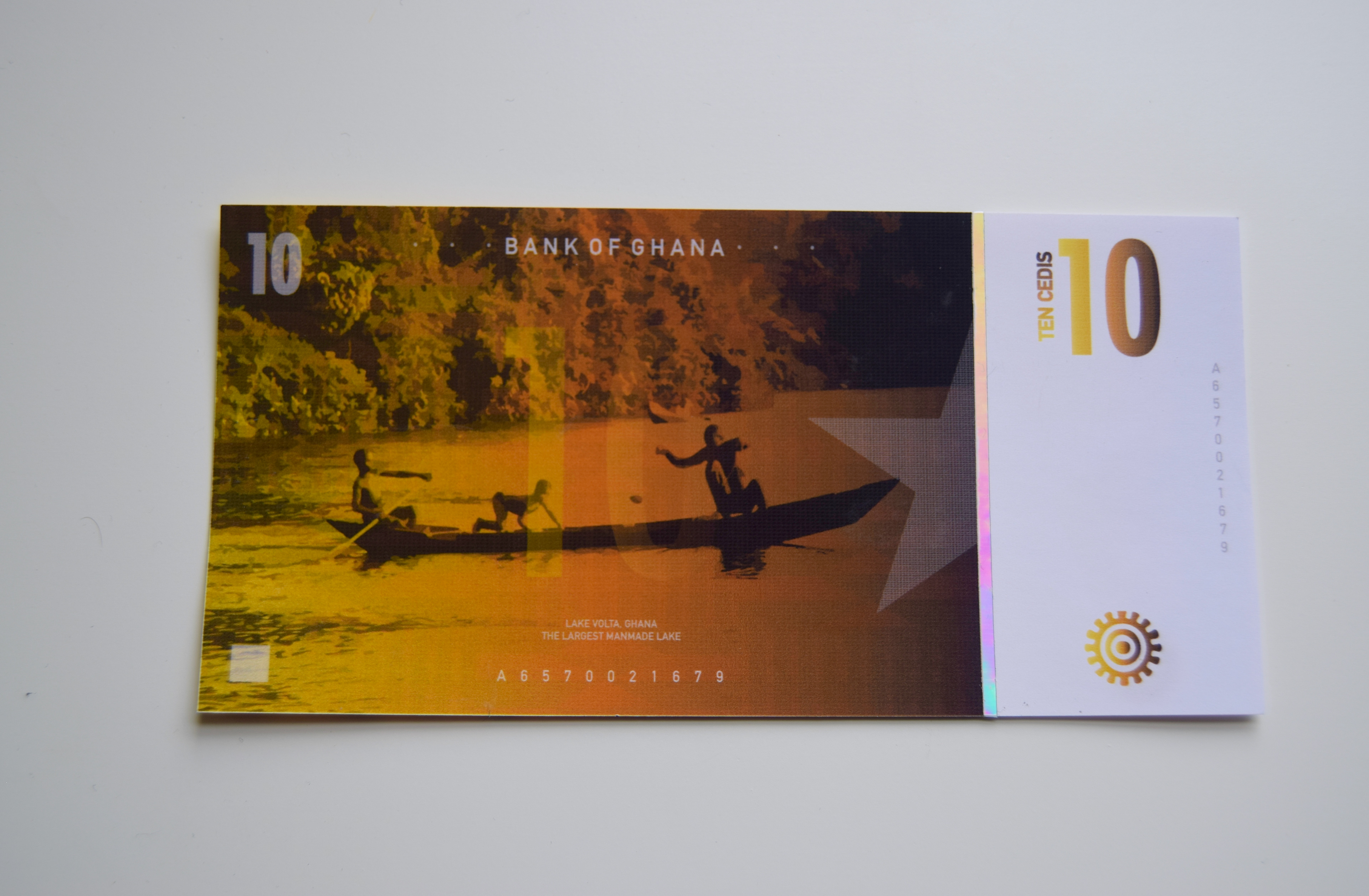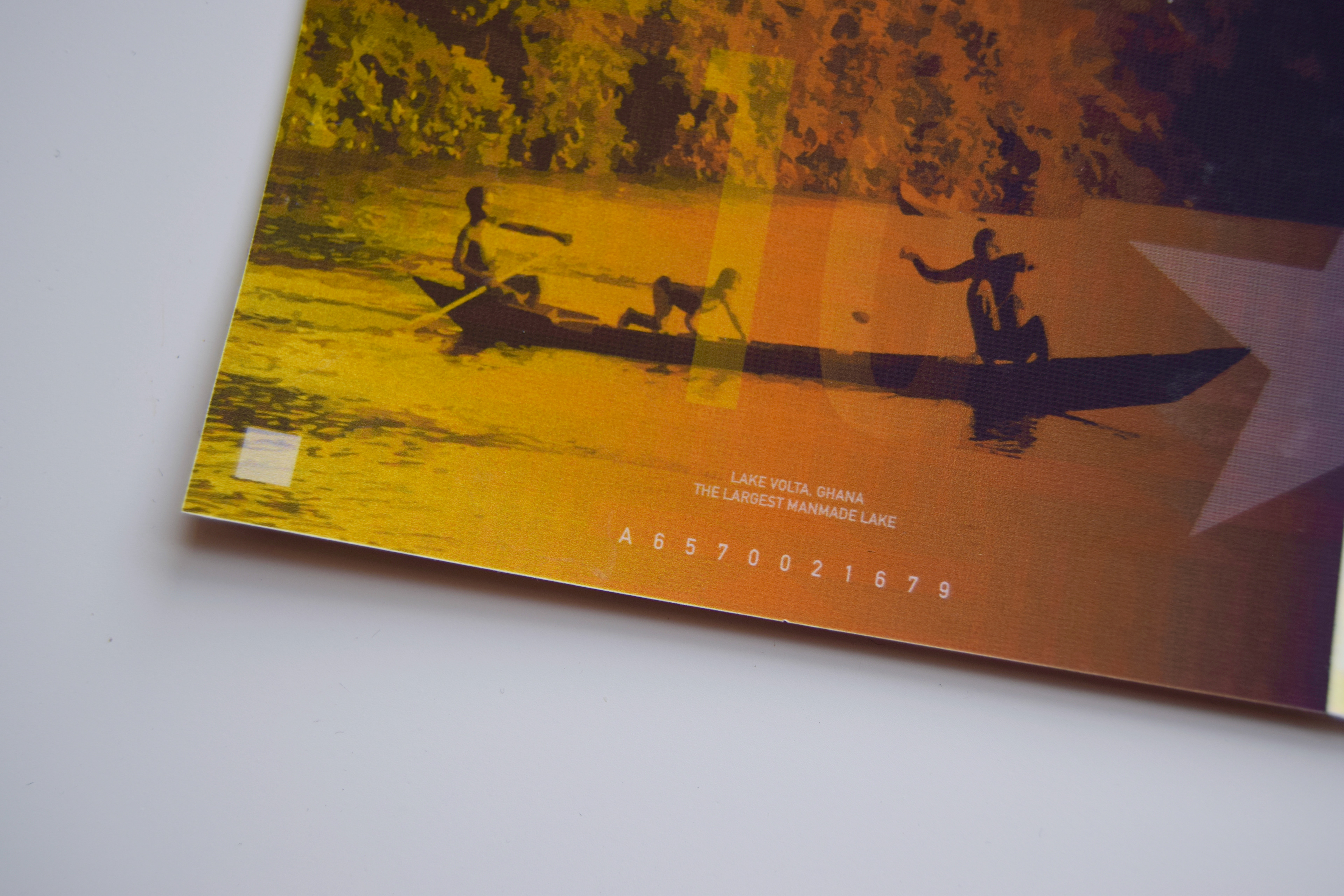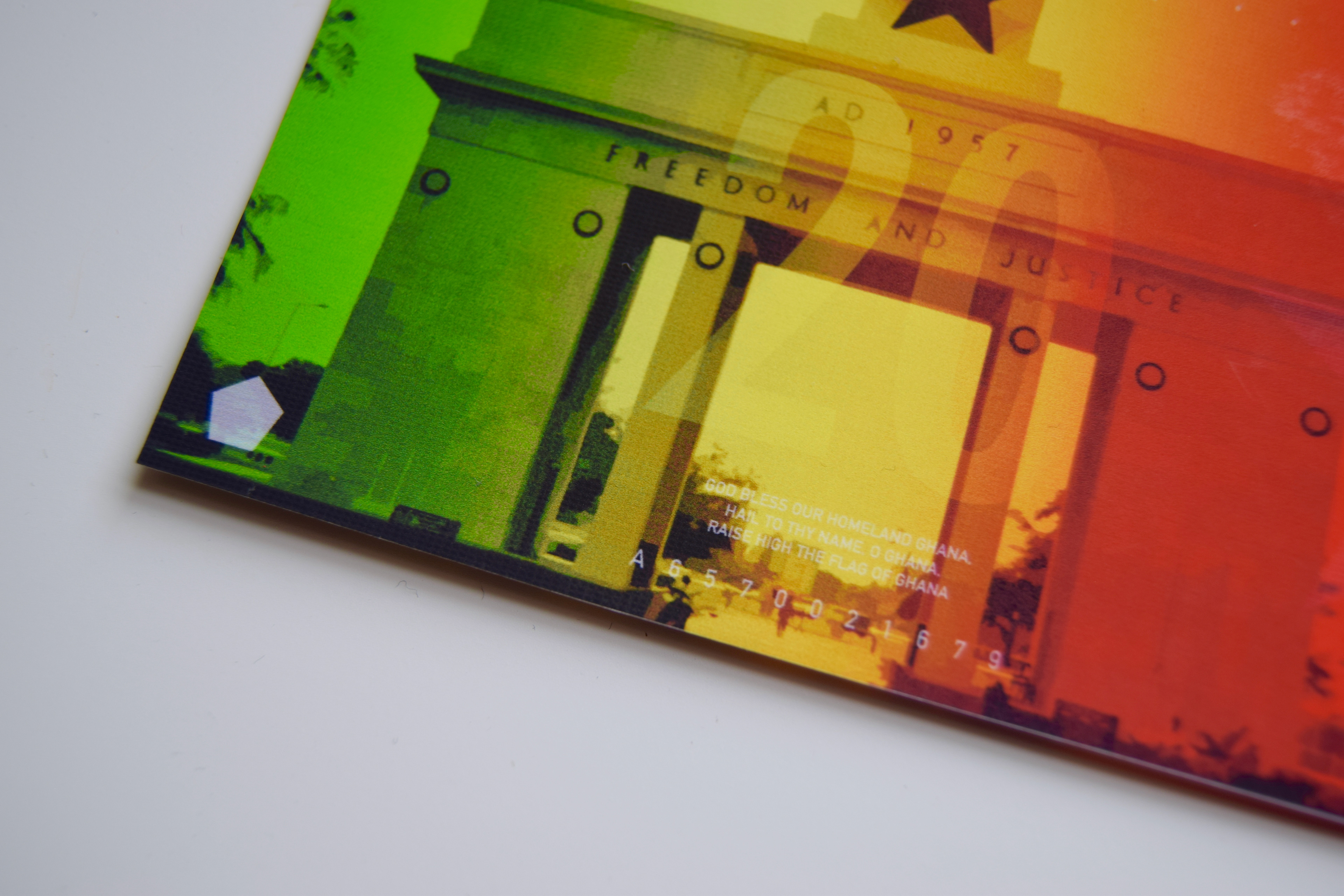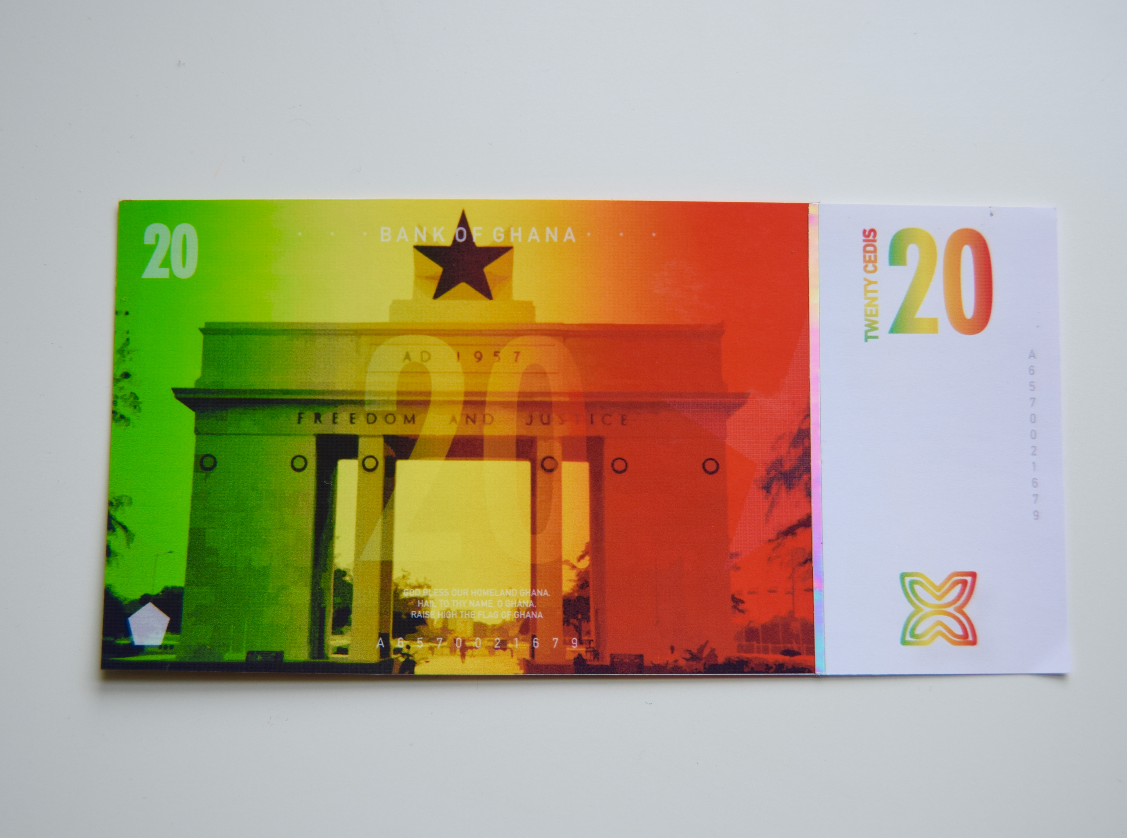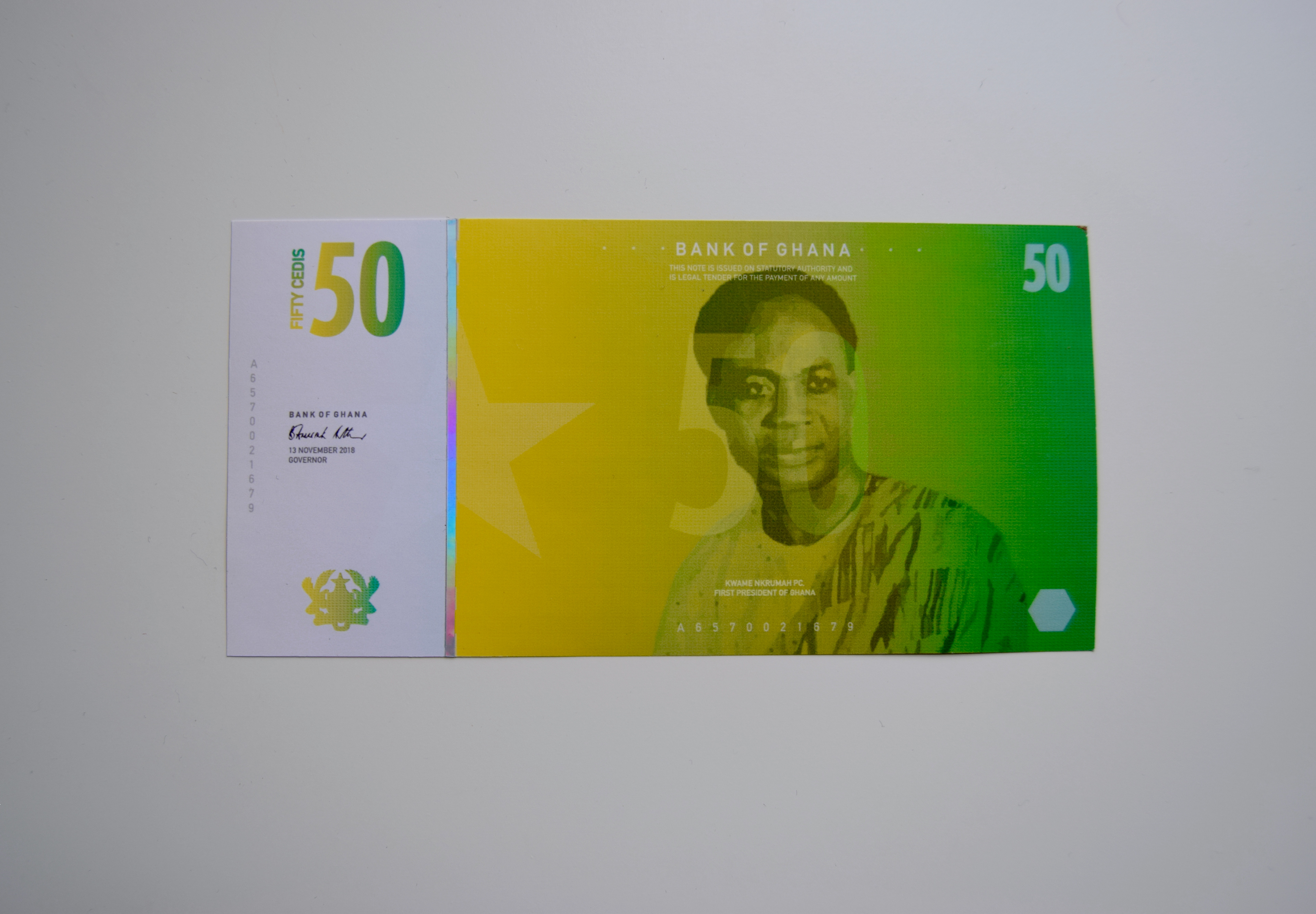
BANK OF GHANA 🇬🇭 (2019)
THE BRIEF
Set by External Partner of University of Southampton, Winchester School of Art - De La Rue
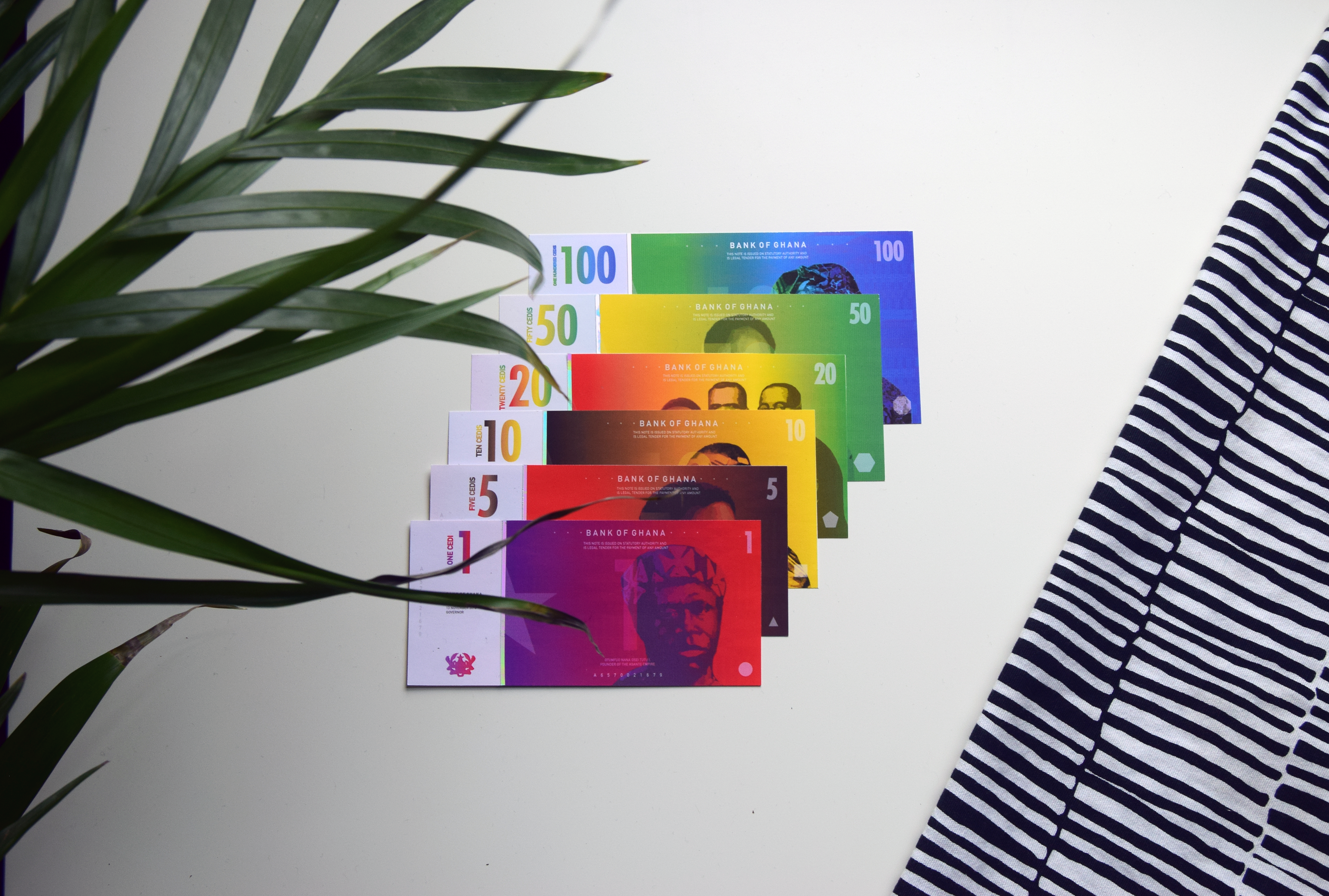
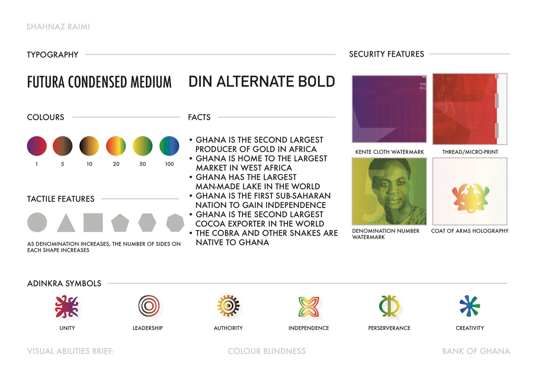
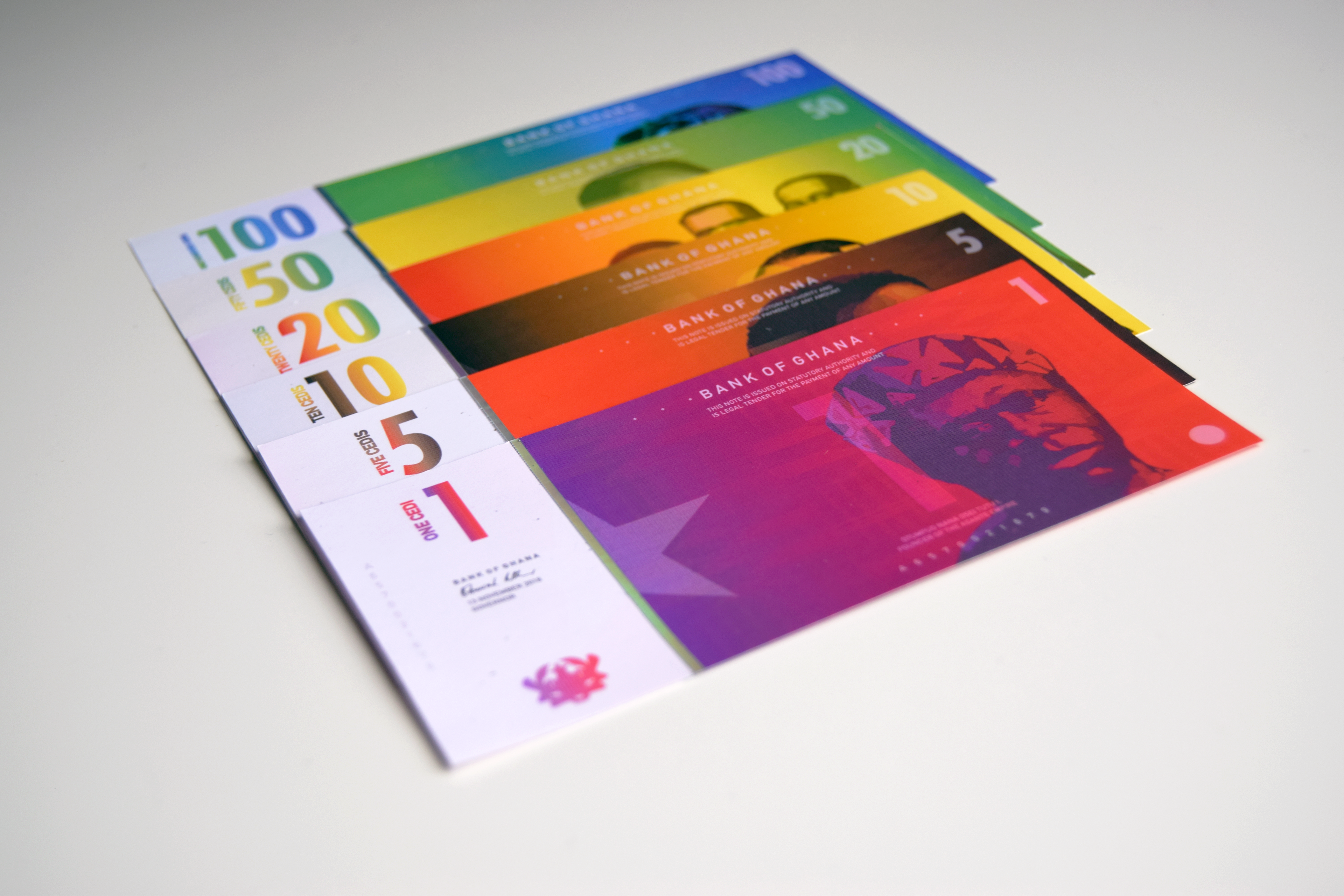
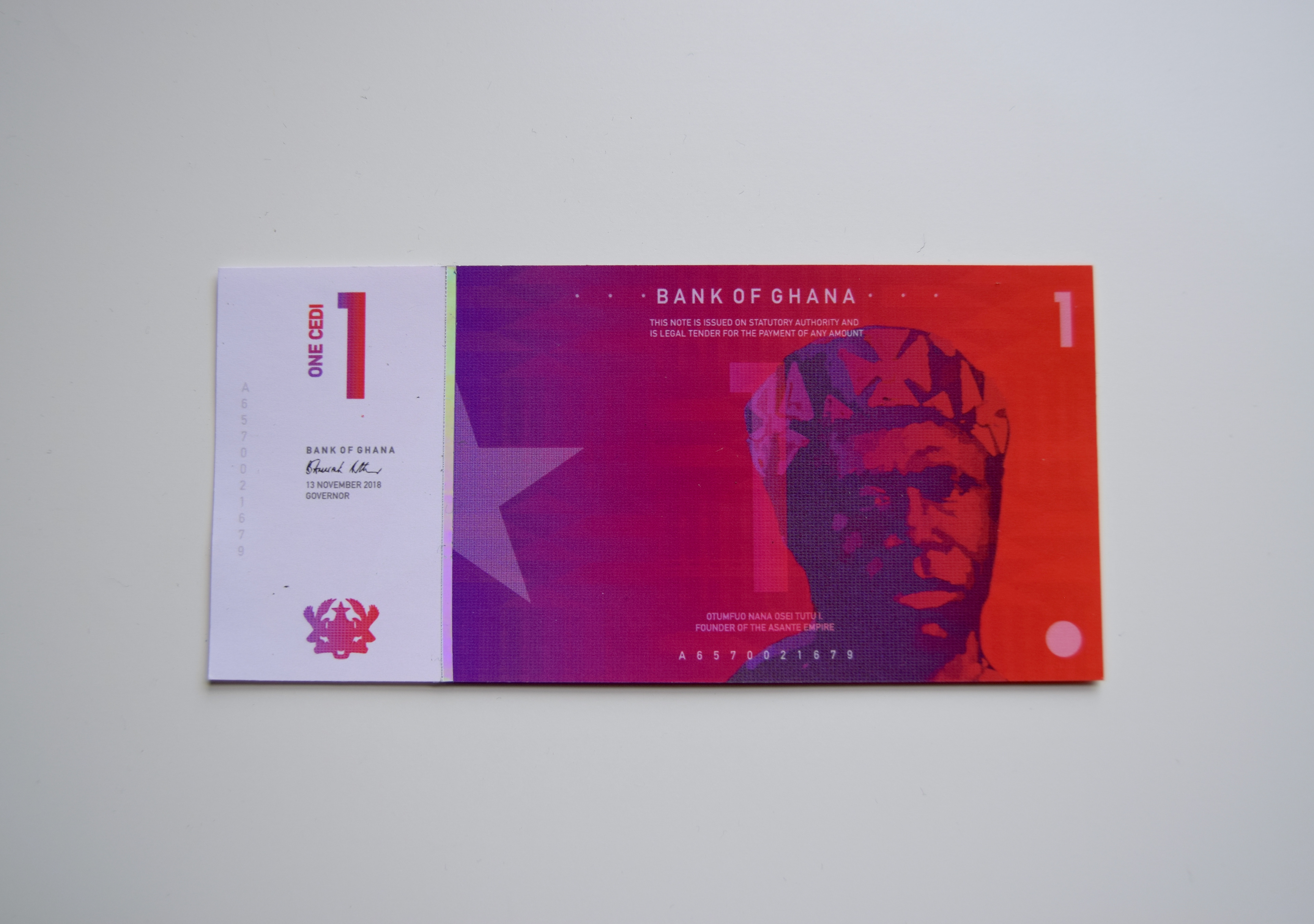
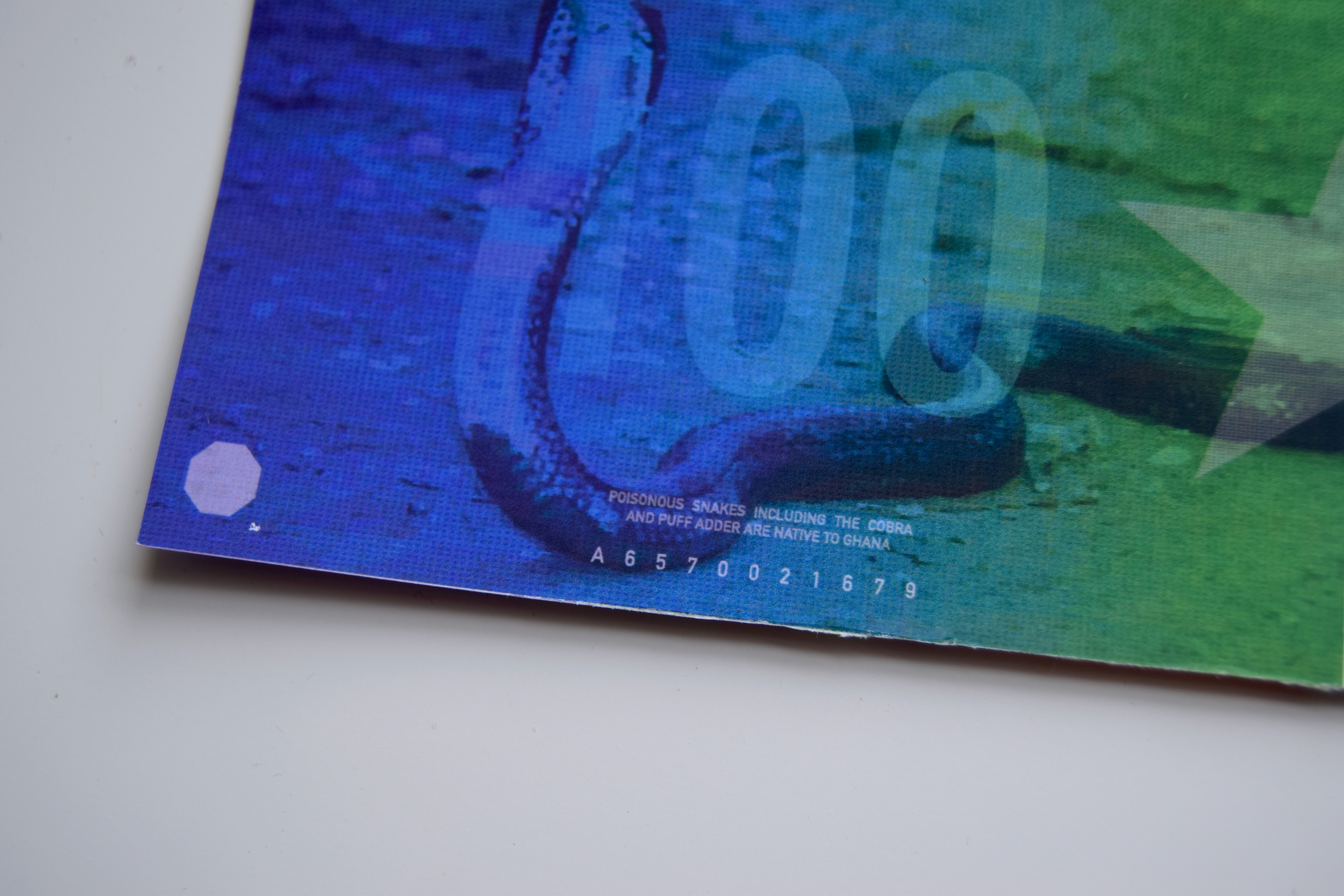
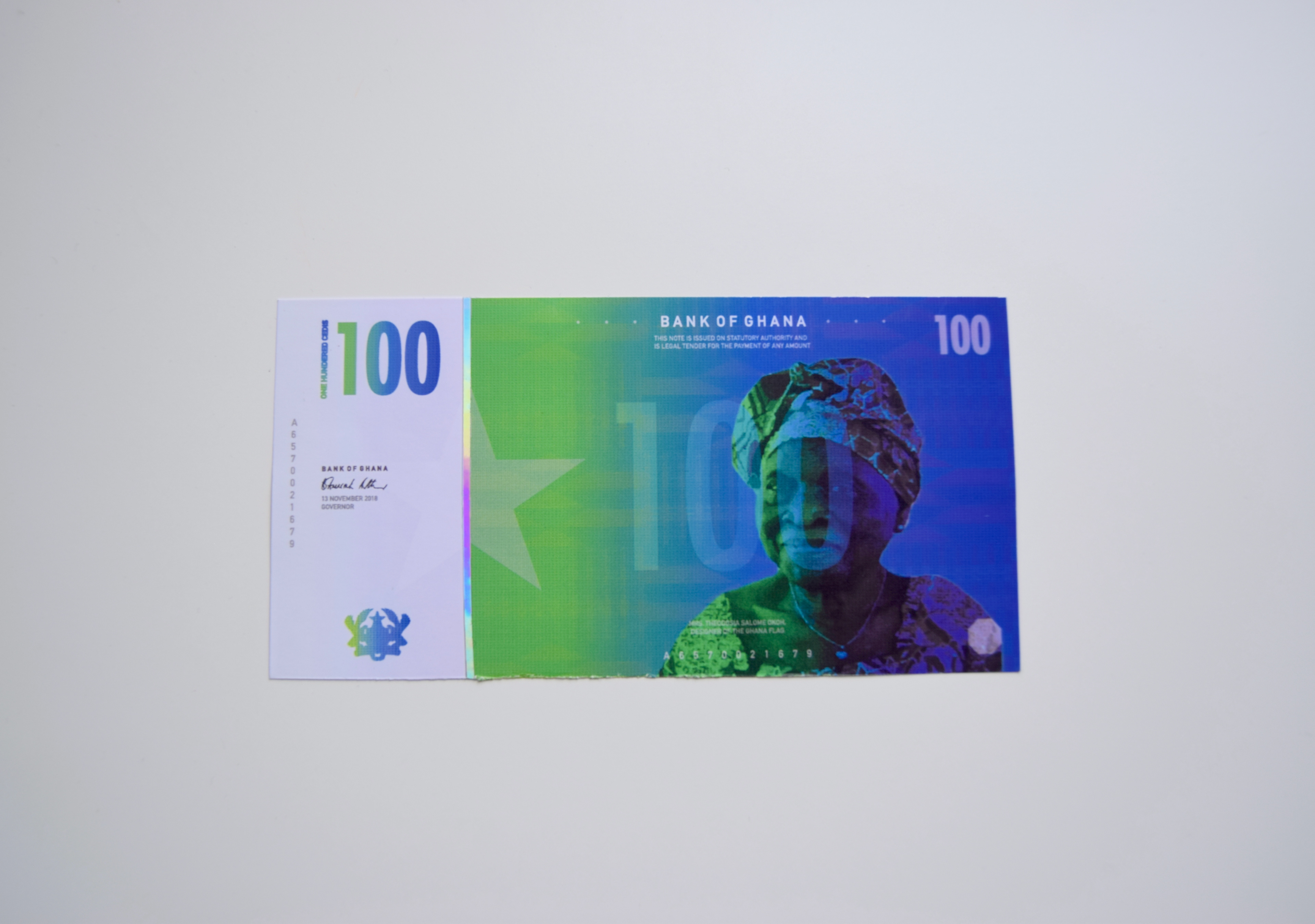
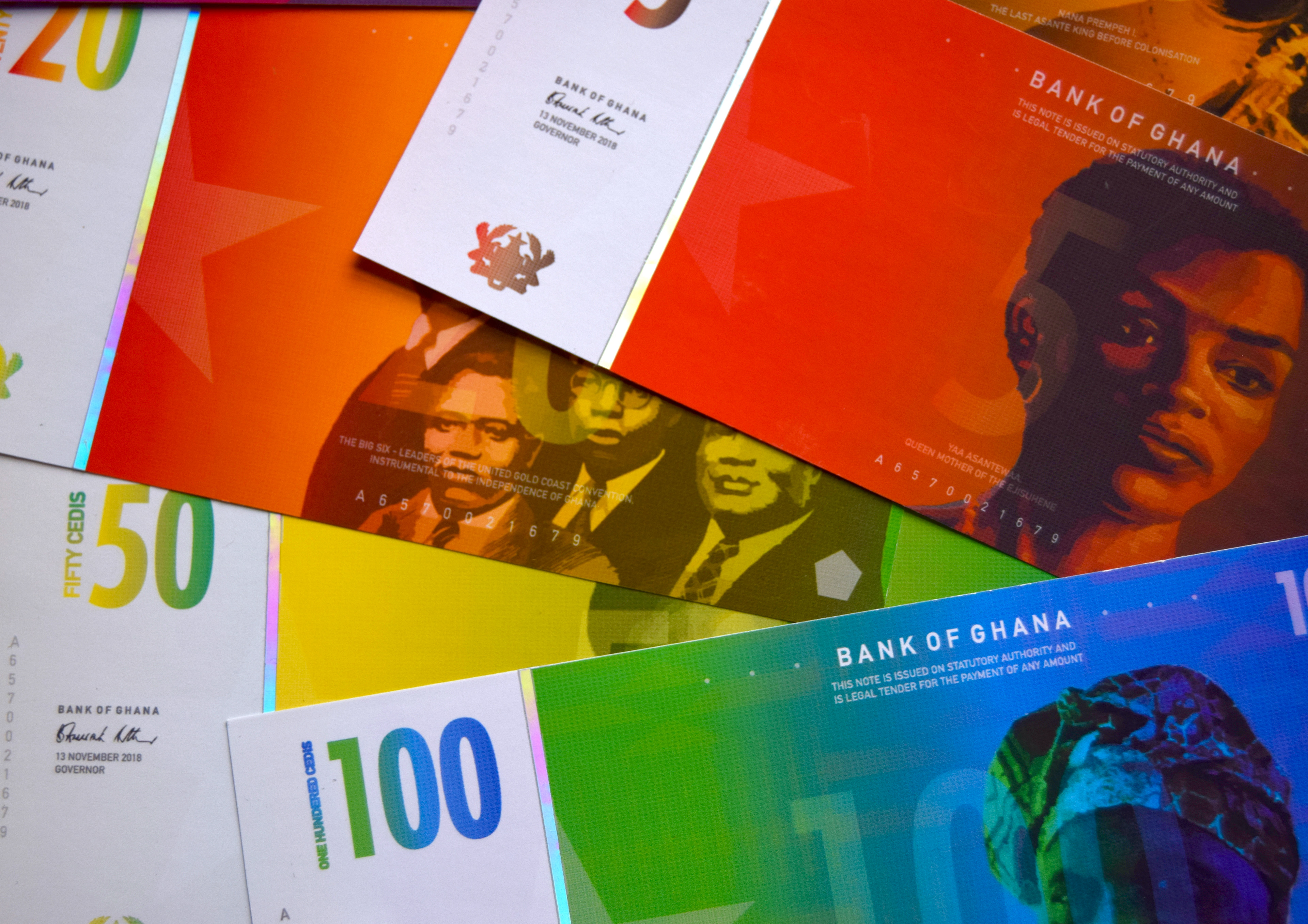
"I have the most common kind of colour blindness. I find it hard to discern red-green tone combinations. I can find it difficult to quickly identify notes, especially when I have a handful to sift through. With my own currency I have become more used to it, although I can be slow paying at a bar or in a shop. Overseas it is much harder when I am not familiar with the currency, especially when it is something like Euros or Dollars - they all look the same to me."
What banknote design strategy can you develop that would improve this experience for people with this kind of visual ability?